 Meet our new project:


- Get Started
- Events
- Router / Navigation
- Store
- Components
- App / Core
- Accordion / Collapsible
- Action Sheet / Actions
- Area Chart
- Autocomplete
- Badge
- Block / Content Block
- Breadcrumbs
- Button
- Calendar / Datepicker
- Cards
- Checkbox
- Chips / Tags
- Color Picker
- Contacts List
- Data Table
- Dialog
- Floating Action Button / FAB
- Form Data / Storage
- Gauge
- Grid / Layout Grid
- Icons
- Infinite Scroll
- Inputs / Form Inputs
- Link
- List Button
- List View
- List Index
- Login Screen
- Menu List
- Messagebar
- Messages
- Navbar
- Notification
- Page
- Panel / Side Panels
- Photo Browser
- Picker
- Pie Chart
- Popover
- Popup
- Preloader
- Progressbar
- Pull to Refresh
- Radio
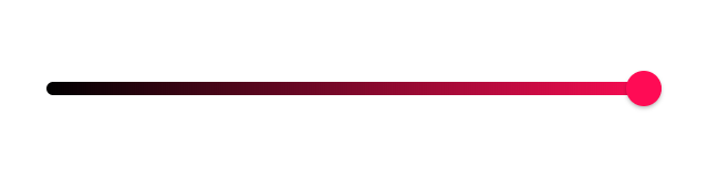
- Range Slider
- Searchbar
- Segmented
- Sheet Modal
- Skeleton
- Smart Select
- Sortable List
- Statusbar
- Stepper
- Subnavbar
- Swipeout
- Swiper
- Tabs
- Text Editor
- Timeline
- Toast
- Toggle
- Toolbar / Tabbar
- Tooltip
- Treeview
- View / Router
- Virtual List
- Framework7 Icons
- Styling
- Dom7
- Touch Utilities
- Utilities
- Plugins API
- Lazy Modules
- Custom Build
Color Picker
Framework7 comes with ultimate modular Color Picker component that allows to create color picker with limitless combinations of "color modules".
Color Picker App Methods
Let's look at related App methods to work with Color Picker:
app.colorPicker.create(parameters)- create Color Picker instance
- parameters - object. Object with Color Picker parameters
Method returns created Color Picker instance
app.colorPicker.destroy(el)- destroy Color Picker instance
- el - HTMLElement or string (with CSS Selector) or object. Color Picker element or Color Picker instance to destroy.
app.colorPicker.get(el)- get Color Picker instance by HTML element
- el - HTMLElement or string (with CSS Selector). Color Picker element.
Method returns Color Picker's instance
app.colorPicker.close(el)- close Color Picker
- el - HTMLElement or string (with CSS Selector). Color Picker element to close.
Method returns Color Picker's instance
For example:
var colorPicker = app.colorPicker.create({
  inputEl: '#color-input',
  value: {
    hex: '#ff000',
  },
});
Color Picker Parameters
Let's look on list of all available Color Picker parameters:
| Parameter | Type | Default | Description |
|---|---|---|---|
| value | object | Object with Color Picker value | |
| modules | array | ['wheel'] | Array with Color Picker modules in order of their appearance |
| palette | array | Array with palette module colors where each palette color must be specified as a HEX string. It can be a plain array with palette values like: Or it can be an array of palette "rows" where each item specified as array with colors: By default it is: | |
| groupedModules | boolean | false | When enabled it will add more exposure to sliders modules to make them look more separated |
| centerModules | boolean | true | When enabled it will try to center vertically modules if there is enough space |
| sliderLabel | boolean | false | When enabled, it will display sliders labels with text |
| sliderValue | boolean | false | When enabled, it will display sliders values |
| sliderValueEdiable | boolean | false | When enabled, it will display sliders values as <input> elements to edit directly |
| barLabel | boolean | false | When enabled, it will display bars labels with text |
| barValue | boolean | false | When enabled, it will display bars values |
| barValueEdiable | boolean | false | When enabled, it will display bars values as <input> elements to edit directly |
| hexLabel | boolean | false | When enabled, it will display HEX module label text, e.g. HEX |
| hexValueEditable | boolean | false | When enabled, it will display HEX module value as <input> element to edit directly |
| Labels Texts | |||
| redLabelText | string | 'R' | Red slider/bar label text |
| greenLabelText | string | 'G' | Green slider/bar label text |
| blueLabelText | string | 'B' | Blue slider/bar label text |
| hueLabelText | string | 'H' | Hue slider label text |
| saturationLabelText | string | 'S' | Saturation slider label text |
| brightnessLabelText | string | 'B' | Brightness slider label text |
| hexLabelText | string | 'HEX' | HEX module label text |
| alphaLabelText | string | 'A' | Alpha (opacity) slider label text |
| formatValue | function (value) | Function to format input value, should return new/formatted string value. value is the Color Picker value object. By default it returns HEX value. | |
| Container/opener-specific parameters | |||
| containerEl | string HTMLElement | String with CSS selector or HTMLElement where to place generated Color Picker HTML. Use only for inline color picker | |
| openIn | string | popover | Can be auto, popover (to open color picker in popover), sheet (to open in sheet modal), popup (to open in Popup) or page (to open in Page). In case of auto it will as specified openInPhone parameter on small screens and in popover on large screens. |
| openInPhone | string | popup | Defines how to open Color Picker on small screens when openIn: "auto" |
| popupPush | boolean | false | Enables color picker popup to push view/s behind on open |
| popupSwipeToClose | boolean | undefined | Enables ability to close color picker popup with swipe. When not specified it inherits app's Popup swipeToClose parameter |
| sheetPush | boolean | false | Enables color picker sheet to push view/s behind on open |
| sheetSwipeToClose | boolean | undefined | Enables ability to close color picker sheet with swipe. When not specified it inherits app's Sheet swipeToClose parameter |
| inputEl | string or HTMLElement | String with CSS selector or HTMLElement with related input element | |
| targetEl | string or HTMLElement | String with CSS selector or HTMLElement with related target element. In addition to input element, you will probably want to place additional element that displays currently selected color. Such element can be specified as target element. If Color Picker opened in Popover, it will be positioned around this target element. Click on specified target element will also open Color Picker. | |
| targetElSetBackgroundColor | boolean | false | When enabled and you have passed targetEl then it will set background-color with currently selected value to target element. |
| scrollToInput | boolean | true | Scroll viewport (page-content) to input when color picker opened |
| inputReadOnly | boolean | true | Sets "readonly" attribute on specified input |
| cssClass | string | Additional CSS class name to be set on color picker container | |
| closeByOutsideClick | boolean | true | If enabled, picker will be closed by clicking outside of picker or related input element |
| toolbarSheet | boolean | true | Displays Toolbar when opened in Sheet modal |
| toolbarPopover | boolean | false | Displays Toolbar when opened in Popover modal |
| toolbarCloseText | string | Done | Text for Done/Close toolbar button |
| navbarPopup | boolean | true | Displays Navbar when opened in Popup modal |
| navbarCloseText | string | Done | Text for Done/Close navbar button |
| navbarTitleText | string | Color | Navbar title's text |
| navbarBackLinkText | string | Back | Navbar back link's text, available when Color Picker opened in Page |
| routableModals | boolean | false | Will add opened color picker to router history which gives ability to close it by going back in router history and set current route to the color picker modal |
| url | string | color/ | Color Picker modal URL that will be set as a current route |
| view | object | View where to set routing when routableModals enabled. Defaults to parent view of inputEl or main view if not found parent view | |
| backdrop | boolean | Enables Color Picker backdrop (dark semi transparent layer behind). By default it is enabled when Color Picker opened in Popover or Popup. | |
| closeByBackdropClick | boolean | true | When enabled, Color Picker will be closed on backdrop click |
| Render Functions | |||
| renderToolbar | function | Function to render toolbar. Must return toolbar HTML string | |
| renderNavbar | function(date) | Function to render navbar. Must return navbar HTML string | |
| render | function | Function to render color picker. Must return full color picker HTML string | |
| Events | |||
| on | object | Object with events handlers. For example: | |
Note that all following parameters can be used in global app parameters under colorPicker property to set defaults for all color pickers. For example:
var app = new Framework7({
  colorPicker: {
    modules: ['hb-spectrum', 'hue-slider'],
    url: 'select-color/',
  }
});
Color Picker Modules
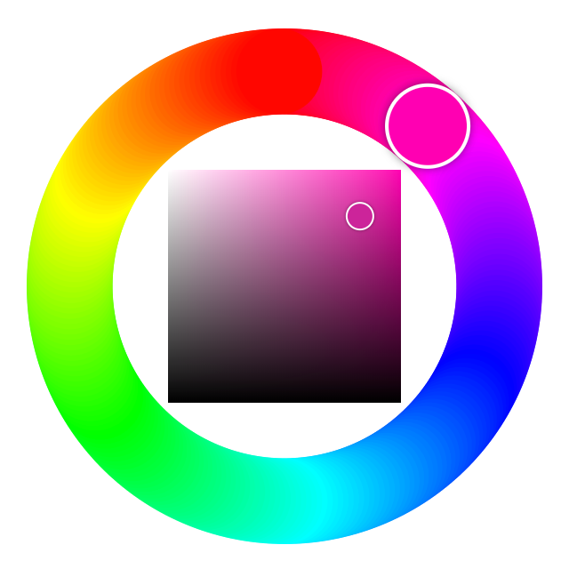
You can create your own Color Picker layout by specifing modules you want to use in modules array parameter on Color Picker creation. There are following modules available:
| wheel | Hue wheel with Saturation-Brightness spectrum inside
|
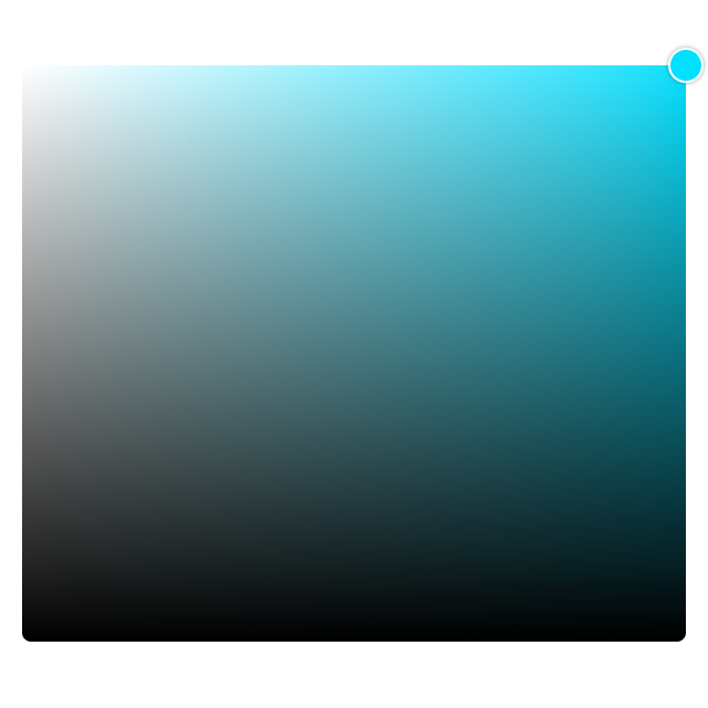
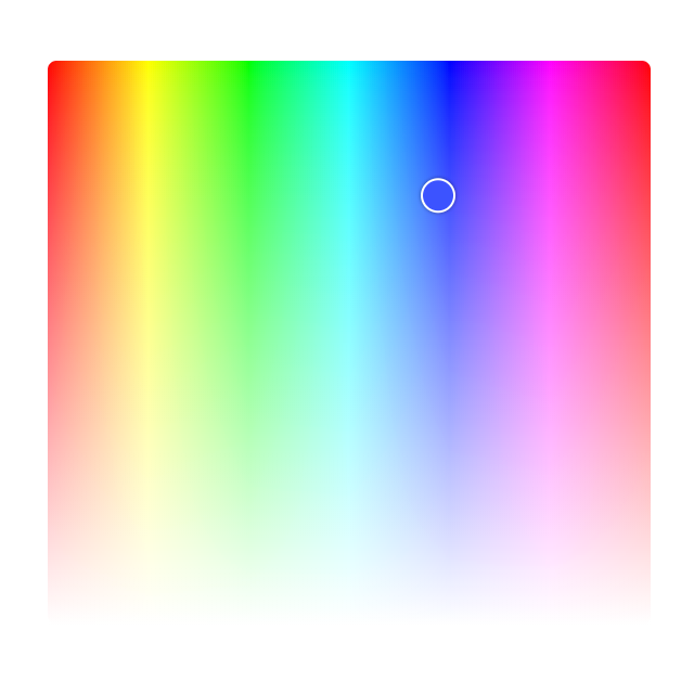
| sb-spectrum | Saturation-Brightness spectrum. It is recommended to use it with
|
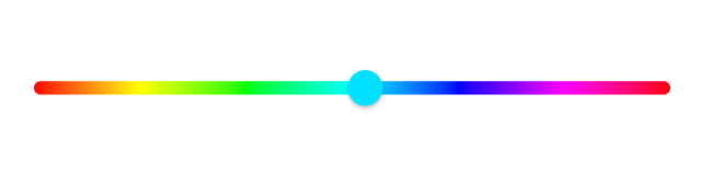
| hue-slider | Single hue slider
|
| hs-spectrum | Hue-Saturation spectrum. It is recommended to use it with
|
| brightness-slider | Single brightness slider
|
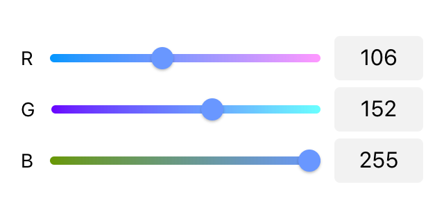
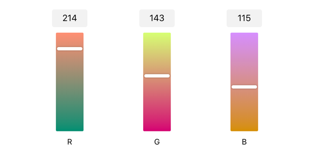
| rgb-sliders | Red, green and blue sliders
|
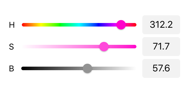
| hsb-sliders | Hue, saturation and brightness sliders
|
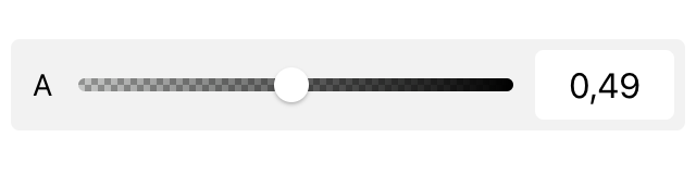
| alpha-slider | Alpha (opacity) single slider
|
| rgb-bars | Vertical red, green and blue sliders
|
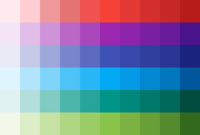
| palette | Module displays palette colors specified in
|
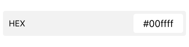
| hex | Module with current HEX value
|
| current-color | Modules displays currently selected color
|
| initial-current-colors | Modules displays currently selected color, and initial color (color that was selected before Color Picker was opened). Clicking on initial color will set Color Picker value to initial color.
|

Custom Modules
It is also possible to use and create custom color picker modules. Such custom modules can be used to create custom pickers or just to add some custom content between modules.
To add custom color picker module, we need to pass an object instead of string to modules array parameter. Custom module object can contain following methods. Each method receives color picker instance as an argument.
| render(colorPicker) | Module render function. It must return module HTML content |
| init(colorPicker) | Module init function. It is executed when module rendered and added to DOM. You should define here any custom event listeners |
| update(colorPicker) | This method executed when color picker value updated |
| destroy(colorPicker) | This method executed on module destroy. You should detach all event listeners here |
For, example if we need to add some custom text between modules, we can use such simple module:
var colorPicker = app.colorPicker.create({
  // ...
  modules: [
    'sb-spectrum',
    // custom module with only render function
    {
      render: function() {
        return '<p class="text-align-center">Enter HUE value:</p>'
      },
    },
    'hue-slider',
  ]
})
For inspiration and how things work in modules, check the built-in modules source code.
Color Picker Value
Color Picker instance value represented as Object with the following properties.
| hex | string | HEX color value, e.g. #ff0000 |
| rgb | array | Array with RGB ([Red, Green, Blue]) color, e.g. [255, 100, 20] |
| hsl | array | Array with HSL ([Hue, Saturation, Lightness]) color, e.g. [320, 0.1, 0.9] |
| hsb | array | Array with HSB/V ([Hue, Saturation, Brightness]) color, e.g. [180, 0.5, 0.3] |
| alpha | number | Alpha (opacity) value (from 0 to 1), e.g. 0.6 |
| hue | number | Hue value (from 0 to 360), e.g. 320 |
| rgba | array | Array with RGBA ([Red, Green, Blue, Alpha]) color, e.g. [255, 100, 20, 0.5] |
| hsla | array | Array with HSLA ([Hue, Saturation, Lightness, Alpha]) color, e.g. [320, 0.1, 0.9, 0.2] |
For example:
var colorPicker = app.colorPicker.create({
  ...
  on: {
    change: function (value) {
      console.log(`HEX value is ${value.hex}. Opacity is ${value.alpha}`);
      $('.some-element').css('background-color', `rgba(${value.rgba.join(', ')})`);
    }
  }
})
Color Picker Methods & Properties
After we initialize Color Picker we have its initialized instance in variable (like colorPicker variable in examples above) with helpful methods and properties:
| Properties | |
|---|---|
| colorPicker.app | Link to global app instance |
| colorPicker.containerEl | Color Picker wrapping container HTML element (when inline color picker is in use) |
| colorPicker.$containerEl | Dom7 instance with color picker wrapping container HTML element (when inline color picker is in use) |
| colorPicker.el | Color Picker HTML element |
| colorPicker.$el | Dom7 instance with color picker HTML element |
| colorPicker.inputEl | Color Picker input HTML element (passed in inputEl parameter) |
| colorPicker.$inputEl | Dom7 instance with color picker input HTML element (passed in inputEl parameter) |
| colorPicker.targetEl | Color Picker target HTML element (passed in targetEl parameter) |
| colorPicker.$targetEl | Dom7 instance with color picker target HTML element (passed in targetEl parameter) |
| colorPicker.value | Object with color picker value |
| colorPicker.opened | true if color picker is currently opened |
| colorPicker.inline | true when inline color picker is in use |
| colorPicker.url | Color Picker URL (that was passed in url parameter) |
| colorPicker.view | Color Picker View (that was passed in view parameter) or found parent view |
| colorPicker.params | Object with initialization parameters |
| Methods | |
| colorPicker.setValue(value) | Set new color picker value. value is the color picker value object which can be specified partially: |
| colorPicker.getValue() | Returns current color picker value |
| colorPicker.update() | Updates color picker modules layout (when opened or inline) |
| colorPicker.open() | Open Color Picker |
| colorPicker.close() | Close Color Picker |
| colorPicker.destroy() | Destroy Color Picker instance and remove all events |
| colorPicker.on(event, handler) | Add event handler |
| colorPicker.once(event, handler) | Add event handler that will be removed after it was fired |
| colorPicker.off(event, handler) | Remove event handler |
| colorPicker.off(event) | Remove all handlers for specified event |
| colorPicker.emit(event, ...args) | Fire event on instance |
Color Picker Events
Color Picker will fire the following DOM events on color picker element and events on app andcolor picker instance:
DOM Events
| Event | Description |
|---|---|
| colorpicker:open | Event will be triggered when Color Picker starts its opening animation |
| colorpicker:opened | Event will be triggered after Color Picker completes its opening animation |
| colorpicker:close | Event will be triggered when Color Picker starts its closing animation |
| colorpicker:closed | Event will be triggered after Color Picker completes its closing animation |
App and Color Picker Instance Events
Color Picker instance emits events on both self instance and app instance. App instance events has same names prefixed with colorPicker.
| Event | Target | Arguments | Description |
|---|---|---|---|
| change | colorPicker | (colorPicker, value) | Event will be triggered when color picker value changes |
| colorPickerChange | app | ||
| init | colorPicker | (colorPicker) | Event will be triggered when color picker initialized |
| colorPickerInit | app | ||
| open | colorPicker | (colorPicker) | Event will be triggered when Color Picker starts its opening animation. As an argument event handler receives color picker instance |
| colorPickerOpen | app | ||
| opened | colorPicker | (colorPicker) | Event will be triggered after Color Picker completes its opening animation. As an argument event handler receives color picker instance |
| colorPickerOpened | app | ||
| close | colorPicker | (colorPicker) | Event will be triggered when Color Picker starts its closing animation. As an argument event handler receives color picker instance |
| colorPickerClose | app | ||
| closed | colorPicker | (colorPicker) | Event will be triggered after Color Picker completes its closing animation. As an argument event handler receives color picker instance |
| colorPickerClosed | app | ||
| beforeDestroy | colorPicker | (colorPicker) | Event will be triggered right before Color Picker instance will be destroyed. As an argument event handler receives color picker instance |
| colorPickerBeforeDestroy | app |
CSS Variables
Below is the list of related CSS variables (CSS custom properties).
:root {
  --f7-color-picker-popover-width: 350px;
  --f7-color-picker-slider-size: 6px;
  --f7-color-picker-bar-size: 50px;
  --f7-color-picker-bar-min-height: 260px;
  --f7-color-picker-value-width: 64px;
  --f7-color-picker-value-height: 32px;
  --f7-color-picker-value-font-size: 16px;
  --f7-color-picker-value-border-radius: 8px;
  --f7-color-picker-hex-value-width: 84px;
  --f7-color-picker-label-font-size: 14px;
  --f7-color-picker-label-width: 10px;
  --f7-color-picker-label-height: 14px;
  --f7-color-picker-sb-spectrum-height: 260px;
  --f7-color-picker-sb-spectrum-handle-size: 16px;
  --f7-color-picker-wheel-width: 330px;
  --f7-color-picker-palette-value-width: 36px;
  --f7-color-picker-palette-value-height: 36px;
  --f7-color-picker-initial-current-color-height: 40px;
  --f7-color-picker-sheet-bg-color: #fff;
  --f7-color-picker-popup-bg-color: #fff;
  --f7-color-picker-value-bg-color: rgba(0, 0, 0, 0.05);
  --f7-color-picker-group-bg-color: rgba(0, 0, 0, 0.05);
  --f7-color-picker-group-value-bg-color: #fff;
}
:root .dark,
:root.dark {
  --f7-color-picker-sheet-bg-color: #121212;
  --f7-color-picker-popup-bg-color: #121212;
  --f7-color-picker-value-bg-color: rgba(255, 255, 255, 0.1);
  --f7-color-picker-group-bg-color: #000;
  --f7-color-picker-group-value-bg-color: rgba(255, 255, 255, 0.12);
}
.ios {
  --f7-color-picker-initial-current-color-border-radius: 16px;
}
.md {
  --f7-color-picker-initial-current-color-border-radius: 4px;
}
Examples
<template>
  <div class="page">
    <div class="navbar">
      <div class="navbar-bg"></div>
      <div class="navbar-inner sliding">
        <div class="left">
          <a class="link back">
            <i class="icon icon-back"></i>

          </a>
        </div>
        <div class="title">Color Picker</div>
      </div>
    </div>
    <div class="page-content">
      <div class="block block-strong inset">
        <p>Framework7 comes with ultimate modular Color Picker component that allows to create color picker with
          limitless combinations of color modules.</p>
      </div>

      <div class="block-title">Color Wheel</div>
      <div class="block-header">Minimal example with color wheel in Popover</div>
      <div class="list list-strong inset">
        <ul>
          <li>
            <div class="item-content item-input">
              <div class="item-media">
                <i class="icon demo-list-icon" id="demo-color-picker-wheel-value"></i>
              </div>
              <div class="item-inner">
                <div class="item-input-wrap">
                  <input type="text" placeholder="Color" readonly="readonly" id="demo-color-picker-wheel" />
                </div>
              </div>
            </div>
          </li>
        </ul>
      </div>

      <div class="block-title">Saturation-Brightness Spectrum</div>
      <div class="block-header">SB Spectrum + Hue Slider in Popover</div>
      <div class="list list-strong inset">
        <ul>
          <li>
            <div class="item-content item-input">
              <div class="item-media">
                <i class="icon demo-list-icon" id="demo-color-picker-spectrum-value"></i>
              </div>
              <div class="item-inner">
                <div class="item-input-wrap">
                  <input type="text" placeholder="Color" readonly="readonly" id="demo-color-picker-spectrum" />
                </div>
              </div>
            </div>
          </li>
        </ul>
      </div>

      <div class="block-title">Hue-Saturation Spectrum</div>
      <div class="block-header">HS Spectrum + Brightness Slider in Popover</div>
      <div class="list list-strong inset">
        <ul>
          <li>
            <div class="item-content item-input">
              <div class="item-media">
                <i class="icon demo-list-icon" id="demo-color-picker-hs-spectrum-value"></i>
              </div>
              <div class="item-inner">
                <div class="item-input-wrap">
                  <input type="text" placeholder="Color" readonly="readonly" id="demo-color-picker-hs-spectrum" />
                </div>
              </div>
            </div>
          </li>
        </ul>
      </div>

      <div class="block-title">RGB Sliders</div>
      <div class="block-header">RGB sliders with labels and values in Popover</div>
      <div class="list list-strong inset">
        <ul>
          <li>
            <div class="item-content item-input">
              <div class="item-media">
                <i class="icon demo-list-icon" id="demo-color-picker-rgb-value"></i>
              </div>
              <div class="item-inner">
                <div class="item-input-wrap">
                  <input type="text" placeholder="Color" readonly="readonly" id="demo-color-picker-rgb" />
                </div>
              </div>
            </div>
          </li>
        </ul>
      </div>

      <div class="block-title">RGBA Sliders</div>
      <div class="block-header">RGB sliders + Alpha Slider with labels and values in Popover</div>
      <div class="list list-strong inset">
        <ul>
          <li>
            <div class="item-content item-input">
              <div class="item-media">
                <i class="icon demo-list-icon" id="demo-color-picker-rgba-value"></i>
              </div>
              <div class="item-inner">
                <div class="item-input-wrap">
                  <input type="text" placeholder="Color" readonly="readonly" id="demo-color-picker-rgba" />
                </div>
              </div>
            </div>
          </li>
        </ul>
      </div>

      <div class="block-title">HSB Sliders</div>
      <div class="block-header">HSB sliders with labels and values in Popover</div>
      <div class="list list-strong inset">
        <ul>
          <li>
            <div class="item-content item-input">
              <div class="item-media">
                <i class="icon demo-list-icon" id="demo-color-picker-hsb-value"></i>
              </div>
              <div class="item-inner">
                <div class="item-input-wrap">
                  <input type="text" placeholder="Color" readonly="readonly" id="demo-color-picker-hsb" />
                </div>
              </div>
            </div>
          </li>
        </ul>
      </div>

      <div class="block-title">RGB Bars</div>
      <div class="block-header">RGB bars with labels and values in Popover on tablet and in Popup on phone</div>
      <div class="list list-strong inset">
        <ul>
          <li>
            <div class="item-content item-input">
              <div class="item-media">
                <i class="icon demo-list-icon" id="demo-color-picker-rgb-bars-value"></i>
              </div>
              <div class="item-inner">
                <div class="item-input-wrap">
                  <input type="text" placeholder="Color" readonly="readonly" id="demo-color-picker-rgb-bars" />
                </div>
              </div>
            </div>
          </li>
        </ul>
      </div>

      <div class="block-title">RGB Sliders + Colors</div>
      <div class="block-header">RGB sliders with labels and values in Popover, and previous and current color values
        blocks</div>
      <div class="list list-strong inset">
        <ul>
          <li>
            <div class="item-content item-input">
              <div class="item-media">
                <i class="icon demo-list-icon" id="demo-color-picker-rgb-initial-current-colors-value"></i>
              </div>
              <div class="item-inner">
                <div class="item-input-wrap">
                  <input type="text" placeholder="Color" readonly="readonly"
                    id="demo-color-picker-rgb-initial-current-colors" />
                </div>
              </div>
            </div>
          </li>
        </ul>
      </div>

      <div class="block-title">Palette</div>
      <div class="block-header">Palette opened in Sheet modal on phone and Popover on larger screens</div>
      <div class="list list-strong inset">
        <ul>
          <li>
            <div class="item-content item-input">
              <div class="item-media">
                <i class="icon demo-list-icon" id="demo-color-picker-palette-value"></i>
              </div>
              <div class="item-inner">
                <div class="item-input-wrap">
                  <input type="text" placeholder="Color" readonly="readonly" id="demo-color-picker-palette" />
                </div>
              </div>
            </div>
          </li>
        </ul>
      </div>

      <div class="block-title">Pro Mode</div>
      <div class="block-header">Current Color + HSB Sliders + RGB sliders + Alpha Slider + HEX + Palette with labels and
        editable values</div>
      <div class="list list-strong inset">
        <ul>
          <li>
            <div class="item-content item-input">
              <div class="item-media">
                <i class="icon demo-list-icon" id="demo-color-picker-pro-value"></i>
              </div>
              <div class="item-inner">
                <div class="item-input-wrap">
                  <input type="text" placeholder="Color" readonly="readonly" id="demo-color-picker-pro" />
                </div>
              </div>
            </div>
          </li>
        </ul>
      </div>

      <div class="block-title">Inline Color Picker</div>
      <div class="block-header">SB Spectrum + HSB Sliders</div>
      <div class="block block-strong inset no-padding">
        ${colorPickerInlineValue && $h`
        <div class="padding">
          HEX: ${colorPickerInlineValue.hex}<br />
          Alpha: ${colorPickerInlineValue.alpha}<br />
          Hue: ${colorPickerInlineValue.hue}<br />
          RGB: ${colorPickerInlineValue.rgb.join(', ')}<br />
          HSL: ${colorPickerInlineValue.hsl.join(', ')}<br />
          HSB: ${colorPickerInlineValue.hsb.join(', ')}<br />
          RGBA: ${colorPickerInlineValue.rgba.join(', ')}<br />
          HSLA: ${colorPickerInlineValue.hsla.join(', ')}
        </div>
        `}

        <div id="demo-color-picker-inline"></div>
      </div>

    </div>
  </div>
</template>
<script>
  export default (props, { $f7, $on, $update }) => {
    let colorPickerInlineValue = null;

    let colorPickerWheel;
    let colorPickerSpectrum;
    let colorPickerHsSpectrum;
    let colorPickerRgb;
    let colorPickerRgba;
    let colorPickerHsb;
    let colorPickerRgbBars;
    let colorPickerRgbPrevCurrentColors;
    let colorPickerPalette;
    let colorPickerRgbPro;
    let colorPickerInline;

    $on('pageInit', () => {
      // Default
      colorPickerWheel = app.colorPicker.create({
        inputEl: '#demo-color-picker-wheel',
        targetEl: '#demo-color-picker-wheel-value',
        targetElSetBackgroundColor: true,
        modules: ['wheel'],
        openIn: 'popover',
        value: {
          hex: '#00ff00',
        },
      });
      colorPickerSpectrum = app.colorPicker.create({
        inputEl: '#demo-color-picker-spectrum',
        targetEl: '#demo-color-picker-spectrum-value',
        targetElSetBackgroundColor: true,
        modules: ['sb-spectrum', 'hue-slider'],
        openIn: 'popover',
        value: {
          hex: '#ff0000',
        },
      });
      colorPickerHsSpectrum = app.colorPicker.create({
        inputEl: '#demo-color-picker-hs-spectrum',
        targetEl: '#demo-color-picker-hs-spectrum-value',
        targetElSetBackgroundColor: true,
        modules: ['hs-spectrum', 'brightness-slider'],
        openIn: 'popover',
        value: {
          hex: '#ff0000',
        },
      });
      colorPickerRgb = app.colorPicker.create({
        inputEl: '#demo-color-picker-rgb',
        targetEl: '#demo-color-picker-rgb-value',
        targetElSetBackgroundColor: true,
        modules: ['rgb-sliders'],
        openIn: 'popover',
        sliderValue: true,
        sliderLabel: true,
        value: {
          hex: '#0000ff',
        },
      });
      colorPickerRgba = app.colorPicker.create({
        inputEl: '#demo-color-picker-rgba',
        targetEl: '#demo-color-picker-rgba-value',
        targetElSetBackgroundColor: true,
        modules: ['rgb-sliders', 'alpha-slider'],
        openIn: 'popover',
        sliderValue: true,
        sliderLabel: true,
        value: {
          hex: '#ff00ff',
        },
        formatValue: function (value) {
          return 'rgba(' + value.rgba.join(', ') + ')';
        },
      });
      colorPickerHsb = app.colorPicker.create({
        inputEl: '#demo-color-picker-hsb',
        targetEl: '#demo-color-picker-hsb-value',
        targetElSetBackgroundColor: true,
        modules: ['hsb-sliders'],
        openIn: 'popover',
        sliderValue: true,
        sliderLabel: true,
        formatValue: function (value) {
          return 'hsb(' + value.hsb[0] + (', ' + value.hsb[1] * 1000 / 10 + '%') + (', ' + value.hsb[2] * 1000 / 10 + '%') + ')';
        },
        value: {
          hex: '#00ff00',
        },
      });
      colorPickerRgbBars = app.colorPicker.create({
        inputEl: '#demo-color-picker-rgb-bars',
        targetEl: '#demo-color-picker-rgb-bars-value',
        targetElSetBackgroundColor: true,
        modules: ['rgb-bars'],
        openIn: 'auto',
        barValue: true,
        barLabel: true,
        formatValue: function (value) {
          return 'rgb(' + value.rgb.join(', ') + ')';
        },
        value: {
          hex: '#0000ff',
        },
      });
      colorPickerRgbPrevCurrentColors = app.colorPicker.create({
        inputEl: '#demo-color-picker-rgb-initial-current-colors',
        targetEl: '#demo-color-picker-rgb-initial-current-colors-value',
        targetElSetBackgroundColor: true,
        modules: ['initial-current-colors', 'rgb-sliders'],
        openIn: 'popover',
        sliderValue: true,
        sliderLabel: true,
        formatValue: function (value) {
          return 'rgb(' + value.rgb.join(', ') + ')';
        },
        value: {
          hex: '#ffff00',
        },
      });
      colorPickerPalette = app.colorPicker.create({
        inputEl: '#demo-color-picker-palette',
        targetEl: '#demo-color-picker-palette-value',
        targetElSetBackgroundColor: true,
        modules: ['palette'],
        openIn: 'auto',
        openInPhone: 'sheet',
        palette: [
          ['#FFEBEE', '#FFCDD2', '#EF9A9A', '#E57373', '#EF5350', '#F44336', '#E53935', '#D32F2F', '#C62828', '#B71C1C'],
          ['#F3E5F5', '#E1BEE7', '#CE93D8', '#BA68C8', '#AB47BC', '#9C27B0', '#8E24AA', '#7B1FA2', '#6A1B9A', '#4A148C'],
          ['#E8EAF6', '#C5CAE9', '#9FA8DA', '#7986CB', '#5C6BC0', '#3F51B5', '#3949AB', '#303F9F', '#283593', '#1A237E'],
          ['#E1F5FE', '#B3E5FC', '#81D4FA', '#4FC3F7', '#29B6F6', '#03A9F4', '#039BE5', '#0288D1', '#0277BD', '#01579B'],
          ['#E0F2F1', '#B2DFDB', '#80CBC4', '#4DB6AC', '#26A69A', '#009688', '#00897B', '#00796B', '#00695C', '#004D40'],
          ['#F1F8E9', '#DCEDC8', '#C5E1A5', '#AED581', '#9CCC65', '#8BC34A', '#7CB342', '#689F38', '#558B2F', '#33691E'],
          ['#FFFDE7', '#FFF9C4', '#FFF59D', '#FFF176', '#FFEE58', '#FFEB3B', '#FDD835', '#FBC02D', '#F9A825', '#F57F17'],
          ['#FFF3E0', '#FFE0B2', '#FFCC80', '#FFB74D', '#FFA726', '#FF9800', '#FB8C00', '#F57C00', '#EF6C00', '#E65100'],
        ],
        value: {
          hex: '#FFEBEE',
        },
        formatValue: function (value) {
          return value.hex;
        },
      });

      colorPickerRgbPro = app.colorPicker.create({
        inputEl: '#demo-color-picker-pro',
        targetEl: '#demo-color-picker-pro-value',
        targetElSetBackgroundColor: true,
        modules: ['initial-current-colors', 'sb-spectrum', 'hsb-sliders', 'rgb-sliders', 'alpha-slider', 'hex', 'palette'],
        openIn: 'auto',
        sliderValue: true,
        sliderValueEditable: true,
        sliderLabel: true,
        hexLabel: true,
        hexValueEditable: true,
        groupedModules: true,
        palette: [
          ['#FFEBEE', '#FFCDD2', '#EF9A9A', '#E57373', '#EF5350', '#F44336', '#E53935', '#D32F2F', '#C62828', '#B71C1C'],
          ['#F3E5F5', '#E1BEE7', '#CE93D8', '#BA68C8', '#AB47BC', '#9C27B0', '#8E24AA', '#7B1FA2', '#6A1B9A', '#4A148C'],
          ['#E8EAF6', '#C5CAE9', '#9FA8DA', '#7986CB', '#5C6BC0', '#3F51B5', '#3949AB', '#303F9F', '#283593', '#1A237E'],
          ['#E1F5FE', '#B3E5FC', '#81D4FA', '#4FC3F7', '#29B6F6', '#03A9F4', '#039BE5', '#0288D1', '#0277BD', '#01579B'],
          ['#E0F2F1', '#B2DFDB', '#80CBC4', '#4DB6AC', '#26A69A', '#009688', '#00897B', '#00796B', '#00695C', '#004D40'],
          ['#F1F8E9', '#DCEDC8', '#C5E1A5', '#AED581', '#9CCC65', '#8BC34A', '#7CB342', '#689F38', '#558B2F', '#33691E'],
          ['#FFFDE7', '#FFF9C4', '#FFF59D', '#FFF176', '#FFEE58', '#FFEB3B', '#FDD835', '#FBC02D', '#F9A825', '#F57F17'],
          ['#FFF3E0', '#FFE0B2', '#FFCC80', '#FFB74D', '#FFA726', '#FF9800', '#FB8C00', '#F57C00', '#EF6C00', '#E65100'],
        ],
        formatValue: function (value) {
          return 'rgba(' + value.rgba.join(', ') + ')';
        },
        value: {
          hex: '#00ffff',
        },
      });

      colorPickerInline = app.colorPicker.create({
        containerEl: '#demo-color-picker-inline',
        modules: ['sb-spectrum', 'hsb-sliders', 'alpha-slider'],
        on: {
          change(cp, value) {
            colorPickerInlineValue = value;
            $update();
          },
        },
        value: {
          hex: '#77ff66',
        },
      });
    });
    $on('pageBeforeRemove', () => {
      colorPickerWheel.destroy();
      colorPickerSpectrum.destroy();
      colorPickerHsSpectrum.destroy();
      colorPickerRgb.destroy();
      colorPickerRgba.destroy();
      colorPickerHsb.destroy();
      colorPickerRgbBars.destroy();
      colorPickerRgbPrevCurrentColors.destroy();
      colorPickerPalette.destroy();
      colorPickerRgbPro.destroy();
      colorPickerInline.destroy();
    });

    return $render;
  };

</script>